8 tips for a powerful homepage headline
The few words that make up your headline will be the most important words on your homepage. It's not just me who believes this, the 'Father of Advertising' David Oglivy shared the same belief in the importance of headlines, which he says makes up 80% of the viewers reading.
I've spent a lot of time in the last few months reviewing landing pages, in preparation for the launch of everypage. Each time I see a new landing page, I'm reminded of how important the hero of a landing page is. So I thought I'd share some of my insights and learnings, starting with the headline which is just one part of the hero.
1. Keep your headline to 6-9 words
Having a succinct headline gives the reader an opportunity to understand your product in a few seconds. This is incredibly important because even though people may not like it, first impressions matter! I'll use our own product as a demonstration of this.
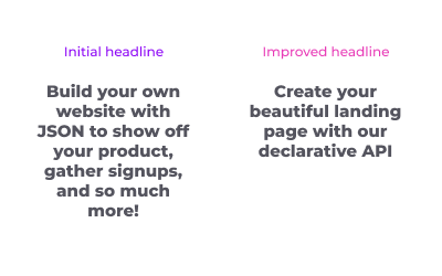
It's not perfect yet but we can all agree it's much better. The shorter headline covers what we do and how it can benefit a user, whilst the longer header doesn't give more clarity to the product and leaves the visitor less engaged. We moved all the other information, such as potential use cases, into the sub title below so if the visitor wants to create a beautiful landing page with an API, they will read on and see all our great benefits.
2. Be specific
Your product is likely to have many value propositions and you won't be able to include all of these in your headline. Pick your most compelling and unique value proposition to help you focus your headline and engage your reader. This will encourage the reader to read on and find out more about your product and other value propositions. Let's say you have a product that allows users to upload audio and get a text version back. A good attempt at a headline would be:
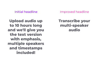
The initial headline clearly covers lots of points about the product, but it's difficult for users to digest and move on - there's way too much going on which might encourage the reader to bounce at this stage. If multi-speaker audio is the feature you think differentiates you from your competitors the most, pick that and stick with it - like we've done in the improved headline. The other awesome features you built can then be put in the subtitle and other sections of your page.
One way to take this even further is to have multiple landing pages targeting different audiences. For example, we could have a landing page for the transcribing product which is specific to podcasts and the headline can be even more specific: 'Transcribe your podcasts with speaker identification'. I'll cover this in more detail in another post.
3. Structure your headline
There are some great formulas and templates out there to help you structure your headline. I personally like this one which I think helps your reader to understand your offering and why they should get this from you.
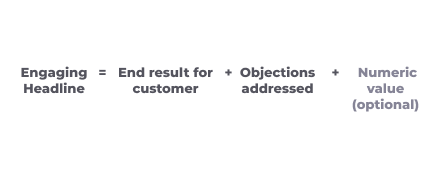
The optional numeric value in this formula could be the high speed of your product or the low cost of your product, or anything else numerically related to your product. Adding numerical values to this formula can, as shown in the example below, add good structure to your headline and encourage readers to keeping reading because numbers are (usually) easy to understand. Let's continue with the transcription example from above. A nice way to get numbers into the headline would be something like:
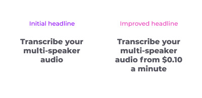
This cheats a bit by having 2 features in the headline, but since all products have a cost the user will be thinking about this so the headline works well as it shows visitors you are proud you can achieve good results at a low cost.
4. Show readers how you help them
This may sound like a tricky ask considering you've only got a few words to do this, it can be done though! Just like when you are designing your product, when you are constructing your headline it's important to address the user's key pain point. If they are interested they will keep reading to see all of your other great features. Let's use the example of a product that allows stay-at-home mums to do labelling work for AI companies.
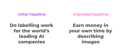
The initial headline sucks for a visitor - it hasn't told them why they should do this and it's focused on why it benefits others (the AI companies here). With the improved headline, we have 2 two things. Firstly, we immediately give the visitor the benefit they would be getting from signing up. Secondly, we clarify the proposition for them by being very clear on what the work is. Even if there are many different types of labelling work, it's hard for a stay-at-home mum (who isn't in tech) to know what 'labelling work' would mean - make it easy for them!
5. Demonstrate your unique-ness
In most cases, there are existing providers (or similar providers) of your product. For this reason, it's important to show what is unique about your product and address any apprehension the reader may have. This guidance from Julian Shapiro can help you to understand how to highlight your value propositions whilst comparing to alternative providers. Let's take a fairly saturated market as an example - personalised t-shirts.
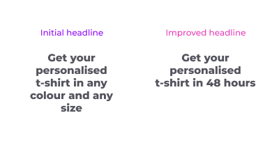
With the initial headline, we're immediately thinking that we could get this anywhere so we don't want to read on. When the headline addresses a common pain point with personalised t-shirts, such as delivery times, then we're much more likely to read on!
6. Connect with the reader
You want the reader to know your page is talking to them specifically. You can do this by connecting with them on an emotional level, for example addressing how they felt before they used your product, or how they will feel after using your product. You can also use the word 'you' in your headline, landing page guru Olly Meakings tells us that this powerful 3-letter word can make readers feel they're spoken to in a human sense which can encourage readers to read on.
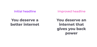
We can see this demonstrated well by Brave who have highlighted what they do for you in their headline. Let's pretend they didn't address 'you' - as shown in the initial headline I made up - we can see (or even feel) the difference in connecting with the reader.
7. Speak boldly to pain points
Similar to the emotional connection just mentioned, if your product's value proposition is resolving a common pain point then we want to highlight this to the reader as early as possible - ideally in the headline! Following on from the Brave example above, we can see the current headline indicates that their product is better than other providers and the pain points are addressed later in the page (in their sub title in this case).
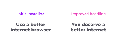
The alternative headline addresses a pain point that the reader may have experienced which increases the chances of them reading on to the sub title and further sections.
8. Avoid slogans
From the 100s of landing pages I've reviewed recently, I'm yet to see one where a slogan works! Slogans may work for well-known companies, however when you're starting out they can leave a reader feeling confused causing them to leave your page. If we consider the example of recipe boxes, a slogan might come to mind.
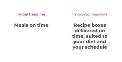
This initial headline could just as well relate to a delivery service from a restaurant, so the reader has to spend extra time to find out more and will most likely stop reading at this point. With the improved headline, we can incorporate the slogan whilst making it more relevant.
Time to engage your readers
I hope you're now in a better place to write your headline! Once you've written it, you can test out how powerful it is by answering this question:
If the visitor reads only this text on your page, will they know exactly what you sell?
I'd love to see your headlines, feel free to share with me on twitter or email. I'd also be happy to review your headline and homepages if you like :) or if you'd like a professional review then get in touch with Olly Meakings who has roasted over 150 landing pages and has proven results - check out his page here.
Made with everypage